Planning a trip, studying world geography, or even checking where a hurricane might go, you’ve probably used a map or a globe. The twist is that they show Earth in very different ways. If you’ve ever thought, “So what’s the difference between maps and globes?” you’re in the right place.
A map is a flat, two-dimensional drawing of Earth (or part of it). A globe is a round, three-dimensional model of the planet. Because of that, they trade off accuracy, detail, and convenience.
In other words, the maps vs globes choice isn’t about which one is “right.” It’s about which one helps you do the job faster and with fewer mistakes. Let’s break down what each tool does best, and when you should grab one over the other.
How Globes Capture Earth’s True Shape Without Any Twists
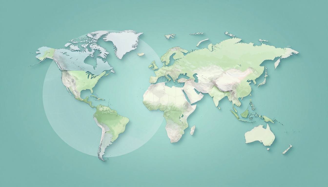
A globe stays honest because it keeps Earth’s round shape. When you look at a globe, you’re seeing a model that matches the real geometry. Continents, oceans, and distances all keep more natural relationships.
On a globe, the biggest payoff is shape and proportion. For example, Antarctica and parts of the Arctic don’t look blown up. Directions also feel more intuitive because the surface isn’t being stretched into a flat sheet.
Maps, however, must flatten the sphere. That’s where the twists start. Flattening a round object is like trying to peel an orange and lay it flat without any stretching. Some parts will stretch, some parts will shrink, and the result depends on how the “stretch” is managed.
Here’s a simple way to think about it:
- A globe shows Earth as a sphere, so distortion stays minimal.
- A map uses a projection, so distortion can’t be fully avoided.
If you want a straightforward comparison of how each tool represents Earth, you can also review Difference Between Map and Globe: A Comprehensive Guide.

Globe pros you’ll feel right away
- True round-world view (no flattening tricks).
- Better relative sizes across the planet.
- More realistic global relationships, like what “near” really means.
Globes also help you understand the world as one connected place. That matters in weather, oceans, and flight planning. You can see how locations relate around the whole planet, not just a piece of it.
Still, globes aren’t perfect for everyday detail. That leads to the next big issue: how maps zoom in.
The Magic of Map Projections and Their Trade-Offs
Maps look simple, but their math is a trade show. A map must turn Earth’s curved surface into a flat plane. That step creates distortions in one or more ways.
Different map projections choose different “favorites.” Some keep shapes closer to correct. Others protect area. Others help with navigation routes. The problem is that no single projection can preserve everything at once.
To understand the reason, the basics of map projections are covered well in Map Projections – Geosciences LibreTexts.
The famous example is the Mercator projection. It’s widely taught because it supports navigation: straight lines on the map can match certain constant directions on the globe. But Mercator grows land areas farther from the equator.

You’ve probably heard the “Greenland looks huge” story. It happens because Mercator stretches areas near the poles. As a result, the Arctic can dominate a world map that’s meant to represent real size.
Other projection types aim for different balances:
- Equal-area projections: better for comparing land area, but shapes can warp.
- Conformal projections: better for preserving angles and local shapes, but size changes.
- Compromise projections: try to reduce multiple distortions, but still won’t be perfect.
Globes avoid these trade-offs because they don’t require flattening. That’s why globes often feel more “correct” when you’re learning big ideas, like the planet’s overall layout.
Maps still win for something else: they deliver details you can actually use.
Maps Deliver Zoom-Level Details Globes Can’t Match
A globe is great for the big picture. But if you want a street, a county line, or a hiking route, you need a map.
Maps can be drawn at different scales, which lets you zoom in on the exact area you care about. A globe has one size, and your view changes only as you move your eyes around the room. You can’t realistically show every street on a globe without switching to a giant model.
Because maps are flat, cartographers can pack in details and label them clearly. You can also print maps at multiple sizes. That means a map can show a whole country, then a city, then a neighborhood.
Here are map types you’ll see in real life:
- Physical maps: show landforms like mountains, rivers, and coastlines.
- Political maps: show borders, states, and countries.
- Thematic maps: focus on one topic, like climate or population.
When a teacher says, “Look at the map,” they usually mean one of these. You’re getting information built for a purpose, not just for general viewing.

Maps also let you show the whole world flat at once. That’s helpful for planning trips, understanding trade routes, or comparing where regions sit. The globe can do it too, but it’s harder to zoom and scan details without turning it into a classroom-sized project.
If you want an overview of common map categories, What Are The Different Types Of Maps? is a good starting point.
Digital maps take this even further. Instead of flipping paper, you tap. You can search for a place, switch layers, and follow real-time traffic. A globe can’t update like that.
That said, maps become even more powerful when they’re specialized for a specific goal.
Specialized Maps for Every Purpose
Think of maps like tools in a toolbox. A globe is the one big tool that helps you understand Earth’s shape. But maps can be built for tasks you do every day.
Road maps help you travel. They highlight routes and connections. Political maps help you learn boundaries. Thematic maps help you interpret data.
For example, a thematic map can show population density by shading areas. Another map can show average rainfall. Another can show earthquake risk zones. Those layers are hard to represent on a globe, because globes are mostly about geometry, not datasets.
Even “simple” maps often focus on what you need most. In a city, a street map emphasizes routes and landmarks. On a hiking trail, a topographic map emphasizes elevation and slope. In a classroom, a world map may emphasize continents and major countries.
So, when you ask which tool is more useful, the honest answer is: it depends on your question.
- If you want where and how it relates globally, a globe is a strong pick.
- If you want what’s inside a specific area, maps are the clear winner.
Portability and Practicality: Maps Win for Travel and Updates
Let’s be honest, globes are hard to carry. They’re heavy, bulky, and usually meant for a desk or classroom. Maps, especially paper and phone maps, are built for movement.
Paper maps fold. They fit in backpacks and glove boxes. They also don’t need a battery. Digital maps fit even better. You can pull one up in seconds.
Now think about updates. Roads change. Borders shift. Construction adds new detours. Paper maps age quickly, but digital maps can refresh regularly.
Globes can’t “patch” new information. The land doesn’t change in a year, but the real world you navigate does. A map app can show a newly opened road or a rerouted highway.
Here’s the practical trade-off in plain terms:
| Tool | Best for | Main downside |
|---|---|---|
| Globe | True round-world view | Not built for fine details |
| Maps | Navigation and zoom-level info | Some distortions from flattening |
If you’re traveling, that matters. You want the next turn, not just a correct mental picture of Earth’s shape.

Globes still shine when you’re learning how Earth works as a system. They help with lessons about seasons, time zones, and global geography. Yet for daily navigation, maps are simply easier.
Even so, the fastest way to combine strengths is through digital tools.
Digital Evolution: Apps and 3D Tools Today
As of March 2026, digital mapping keeps getting more detailed. And some tools even offer a globe-like view.
For example, Google Earth received major updates in early 2026. In early March 2026, Google expanded data layers across the planet. Those layers include elevation contours (every 20 or 40 meters), more EV charging station counts by postal code, and new population data layers.
In addition, you can import large vector datasets and files like KML, KMZ, and GeoJSON on phone or tablet. That makes it easier for planners, researchers, and hobbyists to bring their own data into a 3D Earth view.
So what does that mean for maps vs globes?
- Physical globes still give the best “shape first” understanding.
- Digital globe views can match that feel, while adding interactive detail.
- 2D digital maps still lead for quick navigation and street-level clarity.
Still, it helps to remember the core principle underneath all this. Any flat view uses a projection. Any globe-like view keeps the round shape.

A globe gives you context. A map gives you action.
When to Grab a Map vs Spin a Globe
So when should you use each one? Think in terms of your goal.
Use a map when you need:
- Directions and navigation (especially local streets).
- Fine detail like borders, trails, and land features.
- Specific data (population, climate, or transport).
Use a globe when you need:
- True proportions and a global sense of distance.
- How places relate around the whole planet.
- A quick lesson tool for “round Earth” thinking.
Here are two quick scenarios:
- You’re planning a weekend hike. Grab a topographic map or map app. It shows elevation and routes where you need them.
- You’re studying world geography. Spin a globe to understand the big layout first. Then switch to maps for names and locations.
When you use both, you reduce mistakes. You avoid the “flat map surprises” and you still get the zoom-level detail you want.
The best part is that you don’t have to choose forever. Use the globe for the real shape. Use the map for the real world around you.
Conclusion
When it comes to the difference between maps and globes, the key idea is simple: globes keep Earth round, while maps flatten it. That’s why globes help with accurate global shape and relations. Meanwhile, maps help with detail, labeling, and navigation.
Next time you feel stuck, ask yourself what you actually need. Do you need true shape and big-picture context? Or do you need specific information right now? When you match the tool to the task, geography stops feeling confusing. And you’ll start seeing Earth more clearly, one view at a time.